LightDark

Branding & Identity — Edit this category

Our Cracker Barrel Rebrand
It's not official

Client

Cracker Barrel

Services

Branding, Logo, Strategy

Year

2026

Industry

Retail & E-Commerce

The Challenge

Overview of the
Cracker Barrel Rebrand Project

For clarity, we were not asked by Cracker Barrel to participate in their rebrand. “What had happened was”… lol… we heard they tried a rebrand and it didn’t go well. We thought about it, and thought about it, and thought about it some more until we came up with something we think would help them. It is only our opinion and it is only worth our opinion’s value. 

You see, over time, the Cracker Barrel brand had evolved and, in our opinion, some of the thematic elements that made the logo work visually were lost. If I’m guessing, I imagine the internal creative teams were complaining about these branding issues, rightfully so. At some point Cracker Barrel executives were convinced to go ahead and make some changes and boy, did they. We will share what our research showed (other people’s opinions) and then we’ll share ours and what we came up with as a solution. We’re problem solvers. 

+240%

Increase in positive organic traffic - it could happen!

3x

Revenue growth in 6 months - it could happen!

#1

Comfort food brand

92%

Client satisfaction score

Our Cracker Barrel Rebrand

Our Approach

How We Brought
This to Life

01

Discovery & Strategy

We read the critiques and the press. Some were harsh and we felt many were not thorough from a graphic standpoint. The consensus seems that many people were butt-hurt about the Old Timer iconography being removed. We found it interesting that media outlets failed to mention the removal of the barrel – ahem, in Cracker Barrel. So clearly, in our minds, there were issues across the board. Oh wait – boards! Cracker Barrel has wooden boards, lots of them. Matter of fact, the whole storefront and restaurant is wooden and metal and throwback to the history of the company. More on the Cracker Barrel rebrand and historical context can be read here. Some news outlets even reported foreign interference with bots amplifying the disdain over the rebrand. 

The evolution and history of the Cracker Barrel rebrand
Charlotte Beach's Print Magazine's Critique of the Rebrand

02

Concept & Design

We mentioned thinking about it. Our first observation is that the plaque was changed in the rebrand to a totally different shape. We understood why because if you look at the history of the Cracker Barrel logo the swoosh around it and the lettering has evolved and there’s no longer a typography swoosh where the dent in the top of the logo was. We felt the change in the plaque seemed drastic. It’s akin to changing the shape of someone’s hands or feet. We mood boarded the typography to bring back the swoosh so the plaque shape didn’t have to change. When you’re rebranding the more moderate you can be, the better. Otherwise, you’re going to get the public outcry that Cracker Barrel enjoyed. 

Typography and potential color palette additions to the Cracker Barrel brand
Cracker Barrel Rebrand Solution & Case Study for Education

03

Execution & Delivery

We got almost all the way done with a rebranded logo design that brought back the swoosh in the Cracker Barrel typography and plaque but while continued our brand research, we looked at the Cracker Barrel menu, which is iconic. We were hungry so, makes sense. I mean, who can’t remember a time you were starving and went in for some southern food and stared at the menu. Those elements are engrained in our minds over time. We quickly identified the font choices that have lived in the aesthetics of the Cracker Barrel menu for as long as I can remember and we went to work incorporating that into the rebranded logo. These are the types of changes that in our opinion will win the public over rather than alienating it. It’s recognizable. As a customer, I can relate to it because I remember it. It’s home. 

We redrew the logo with these elements and recorded our progress so others can learn and be inspired not to be mean or to be harsh. We hope that by explaining our process, you will understand why we arrived at the end result. 

Our first attempt at redrawing the Cracker Barrel logo/brand
This was our first attempt and while we like some parts of it including bringing back the folksy curved lettering,
we still felt something was missing. What can we add? More brand research.

04

Results & Impact

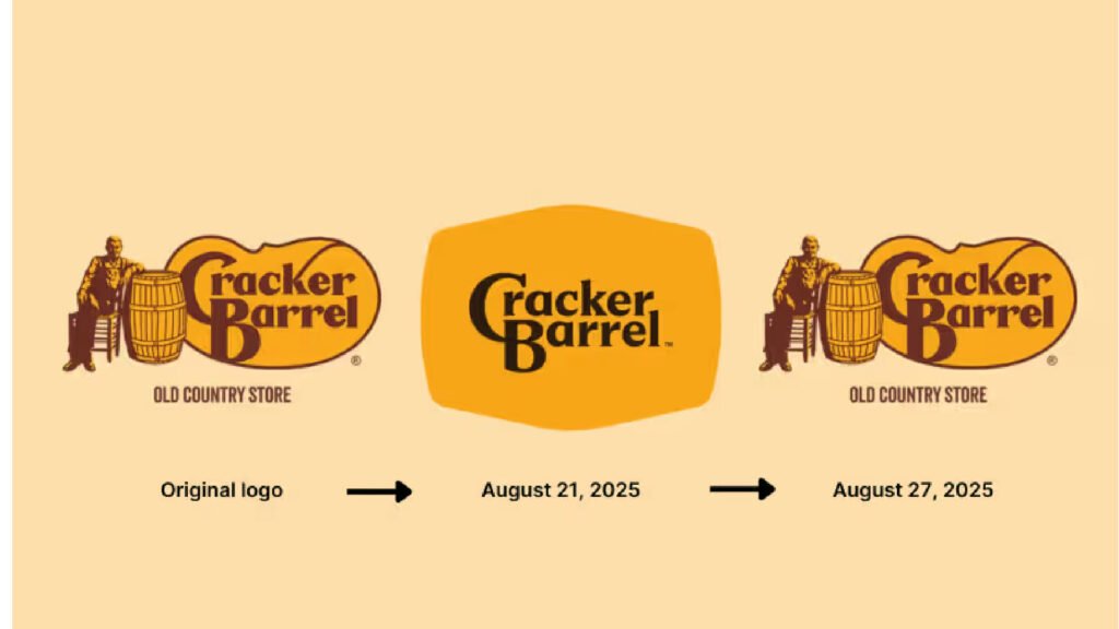
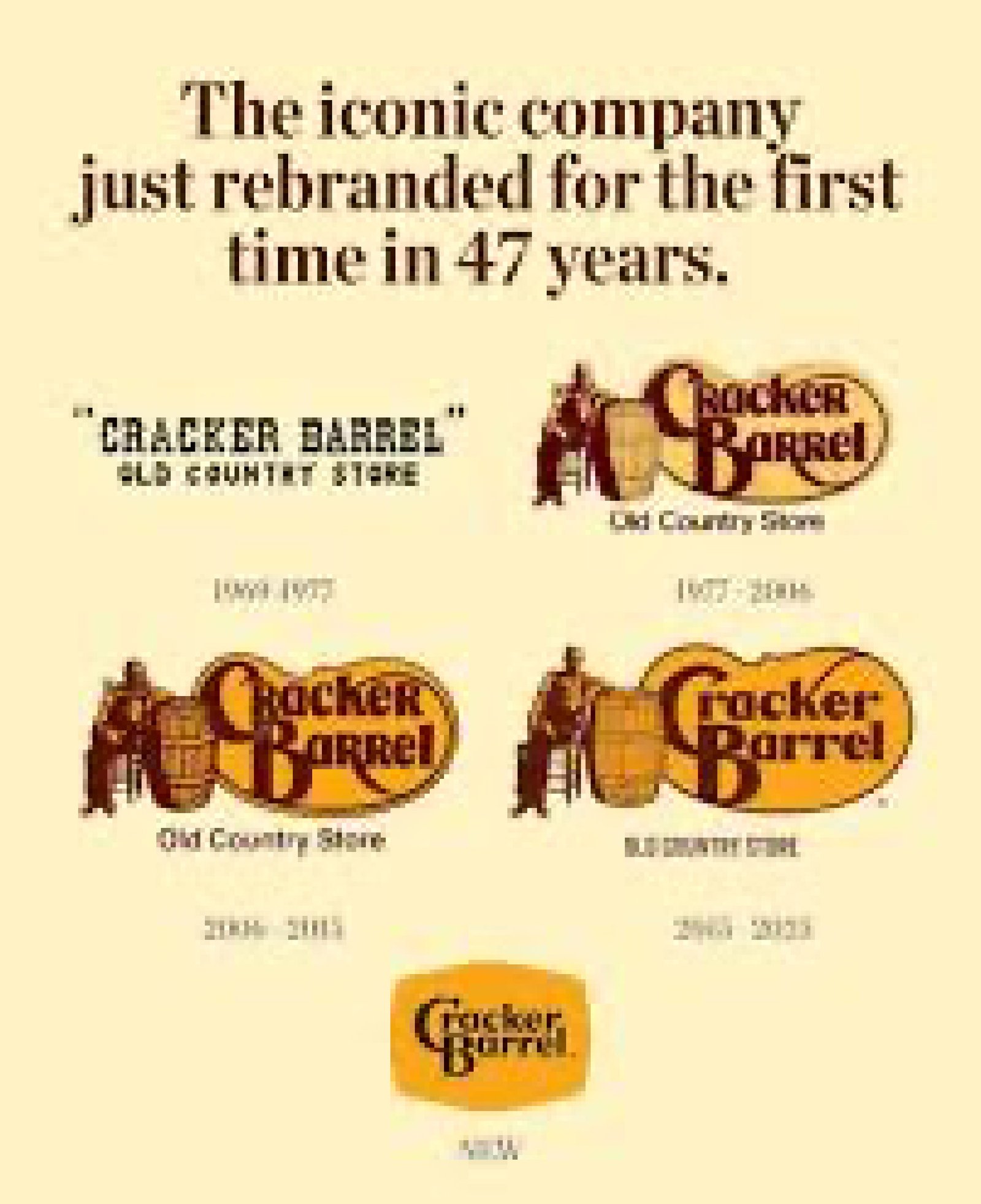
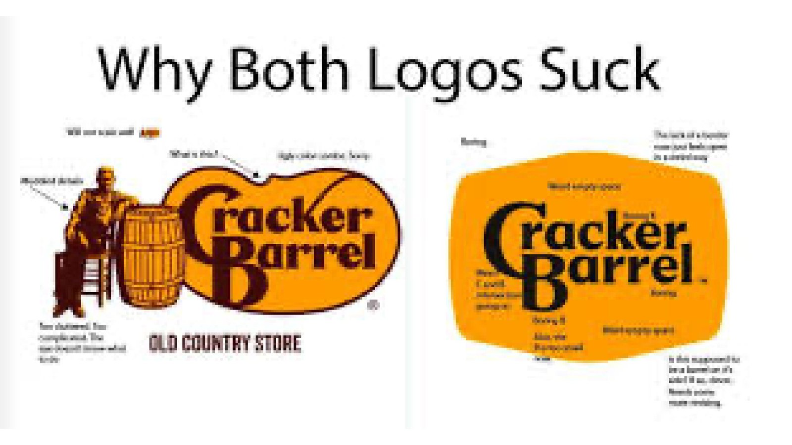
Obviously, we are not hired by Cracker Barrel, although we would love to be. So, if you’re a Cracker Barrel exec and you’re out there reading this, let us know. We would love to have a quick chat. Because this project is near and dear to our hearts, we only want to be a support to your organization.

We would love to submit this to the press and we may just do that. If we do, we’ll come back and edit this case study to reflect the feedback we receive from others. <3 you, Cracker Barrel. 

Cracker Barrel Rebrand Solution Following the Corporate Rebrand, depicts the logo written in the menu font
Our "Final" (Although Nothing Is Ever Final in Design) Cracker Barrel Rebrand Solution. You see, we offer branding help when branding help is needed. This article was written following the Cracker Barrel corporate rebrand which was later rolled back. This image depicts the logo written in the Cracker Barrel menu font and is designed by Ashley Bailey Designs, a marketing and branding agency in Augusta, Georgia

Project Gallery

Ashley Bailey has helped my cosmetic business as we are launching into new categories. I appreciate our partner

Mikahyla Chiles

CEO, Kphoria Cosmetics

Ready to start?

Let's build something
extraordinary together.