Branding & Identity — Edit this category
Melanated Hands
a beauty brand
Client
Makalya
Services
Branding, Logo, Strategy
Year
2025
Industry
Retail & E-Commerce
◆ Search ◆
Augusta, GA · Nationwide · 202-642-9625
Branding & Identity — Edit this category
Client
Makalya
Services
Branding, Logo, Strategy
Year
2025
Industry
Retail & E-Commerce
The Challenge
Before engaging Ashley Bailey Designs, the client was facing a multi-layered challenge rooted primarily in visual identity and digital presence, with brand recognition as a direct consequence of those gaps.
The client operated a beauty and wellness brand spanning three distinct product lines — fingernail, skincare, and haircare — but had no cohesive visual system to unify them. Without a consistent look, feel, or design language across touchpoints, the brand had no recognizable identity, making it nearly impossible to stand out or build loyalty across social media channels.
Compounding this was a content and asset deficit. They lacked the creative materials necessary to fuel social media production, meaning their online presence was either sparse or inconsistent — both of which work against brand recognition in crowded digital spaces like Instagram, TikTok, or Facebook, where visual cohesion is currency.
Their digital presence was also structurally fragmented. The brand lived within the family’s existing website rather than standing on its own, which diluted its perceived legitimacy and made it difficult for consumers to identify it as a distinct, standalone brand. The Shopify storefront needed to feel like its own world — not a subcategory of something else.
Finally, the brand carried meaningful identity markers — women-owned, minority-owned, and veteran-owned — that represented powerful differentiators and story-telling opportunities, but without a strong visual identity and dedicated digital home, those attributes had no proper stage to be communicated from.
In short, the core problem was visual identity, which cascaded into weaknesses in brand recognition and digital presence. They had a product, a story, and a mission — but no cohesive brand to carry it.
+240%
Increase in organic traffic
3x
Revenue growth in 6 months
#1
Ranked keyword position
92%
Client satisfaction score
The client chose Ashley Bailey Designs as their creative partner precisely because the challenge required more than just a logo or a color palette — it required building a complete visual language from the ground up.
They needed a designer who could look at their brand holistically and create a system flexible enough to stretch across three distinct product divisions — fingernail, skincare, and haircare — while still feeling unmistakably unified. Each division needed its own identity, but all three needed to speak the same visual dialect so that a customer encountering the nail line and the skincare line would immediately recognize they belong to the same family.
Ashley Bailey Designs was trusted to deliver exactly that — a cohesive visual identity system that could:
For a brand carrying the weight of being women-owned, minority-owned, and veteran-owned, the visual identity also needed to reflect pride, strength, and credibility — qualities that resonate with their community and set the tone for how the world would receive them.
By engaging Ashley Bailey Designs, the client was making a foundational investment — not just in how the brand looks, but in how it shows up, scales, and is remembered. The goal was to walk away with the visual confidence to expand without limits.
Our Approach
01
Discovery & Strategy
The project opened with a deliberate research phase focused on understanding the competitive landscape the client would be entering — and more importantly, identifying where the opportunity lived.
A scan of the beauty and wellness marketplace revealed a crowded but visually flat field. Many brands, particularly in the indie and mid-market beauty space, leaned heavily on similar design conventions — minimalist packaging, muted skin-tone palettes, and an aesthetic language built around representation of complexion rather than the experience of the product itself. While that approach had its moment, it had become so widespread that it was no longer differentiating. It blended, rather than stood out.
That insight became a strategic unlock. The market had created a gap — shelf space, both physical and digital, where a brand with bold, distinctive, joy-forward visuals could immediately command attention and feel like something genuinely new.
What was learned about the client and their audience reinforced this direction. This was a brand built by a woman, a minority, and a veteran — someone who had earned confidence through real experience. Their audience wasn’t just buying beauty products; they were buying into a feeling, a result, a lifestyle elevation. The visual identity needed to reflect that energy and outcome rather than defaulting to the skin-tone-forward aesthetic that had become the category shorthand.
The strategic decision was clear — lead with joy, results, and visual boldness. Design a brand that feels like the best version of how you feel after the product works. Something that pops on a Shopify storefront, stops the scroll on Instagram, and holds its own in a retail environment.
The research didn’t just inform the aesthetic — it defined the brand’s competitive position: a beauty brand unafraid to look different, because different is exactly what the market was missing.
02
Concept & Design
The creative direction phase was driven by a single, defining conviction — this brand is bold, and it needed to look like it.
From the outset, the decision was made to deliberately step away from the muted, neutral, skin-tone-driven aesthetic that had become the default visual language of the beauty industry. That palette, while meaningful in its context, had become so pervasive that it was no longer a differentiator — it was wallpaper. For a brand built on innovation, defaulting to that approach would have been a contradiction in terms.
The creative exploration began by removing skin tone from the visual equation entirely. Rather than centering the identity around complexion representation, the focus shifted to something more visceral and experiential — the feeling of the results. The confidence after a fresh set of nails. The glow after a skincare routine. The transformation after a haircare treatment. These are emotional, sensory outcomes, and the visual identity needed to evoke that energy directly.
This led the moodboarding and concept development toward bolder, more intentional color choices — hues with presence, contrast, and personality. Colors that command attention on a screen, hold weight on packaging, and translate powerfully across social media content without losing their integrity.
The concept development was also shaped by the understanding that this brand is an innovation in its space — a multi-division beauty brand with a distinct ownership story and a fresh point of view. That kind of brand doesn’t whisper. It arrives with intention. The visual language needed to match that energy — structured enough to feel premium, bold enough to feel fearless, and distinctive enough to be immediately recognizable across every division and every platform.
Every creative decision made during this phase came back to one question — does this look like a brand that stands out, or one that fades in? The answer always pointed toward bold.
03
Execution & Delivery
PRODUCTION PHASE
The production phase was a full creative build executed entirely within a professional Adobe ecosystem, with each tool selected intentionally to serve a specific stage of the brand’s development — all working toward a singular creative north star: Mission: You.
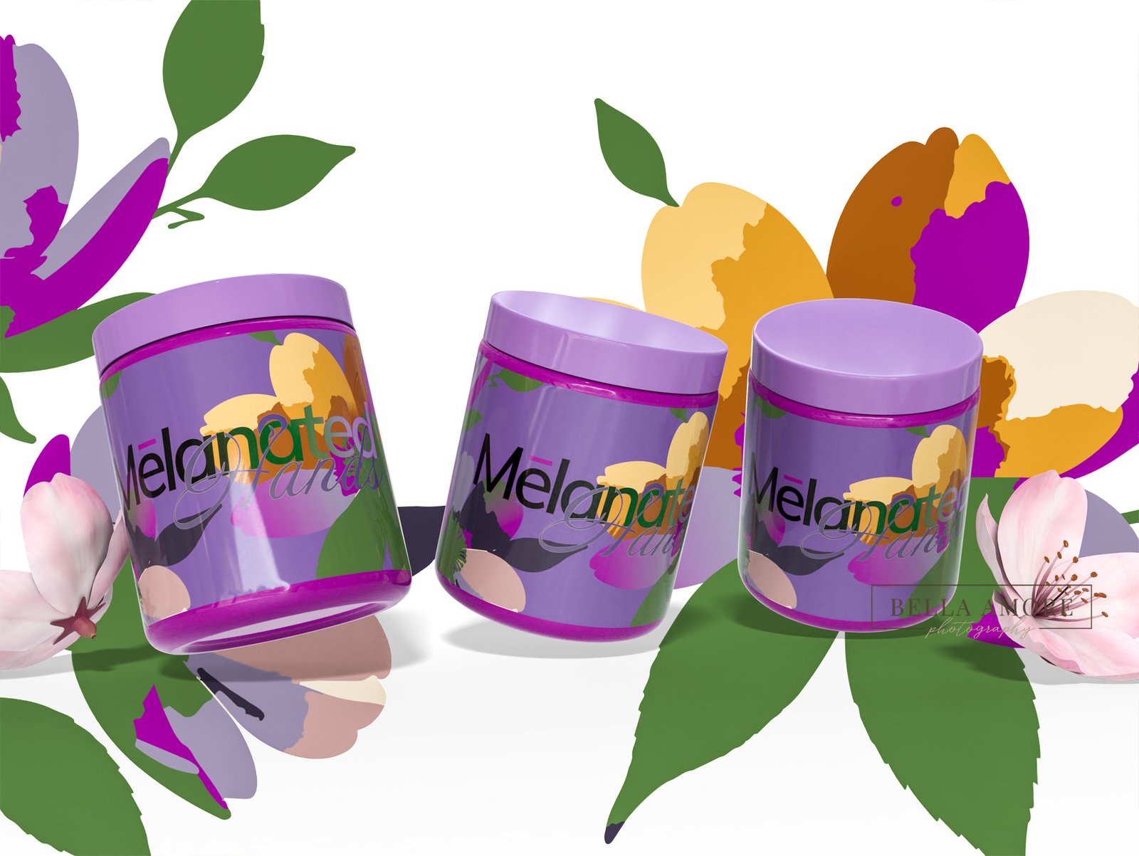
It began in Adobe Illustrator, where the core brand identity was hand-crafted. Rather than relying on abstract shapes or generic design elements, the foundation of the visual identity was drawn from something deeply human — a photograph of a woman’s hands in a natural pose. That image became the design blueprint, grounding the brand in femininity, authenticity, and elegance without leaning on skin tone as the primary visual device. Every line drawn was in service of the woman on the other side of the product — because the mission has always been her.
Color followed form. Adobe Color was used to extract and build the brand’s palette directly from natural floral arrangements, ensuring the colors felt organic, intentional, and alive rather than arbitrarily chosen. This gave the palette a sense of nature-meets-boldness that aligned perfectly with the brand’s positioning and echoed the idea that beauty, like the mission, should feel personal and purposeful.
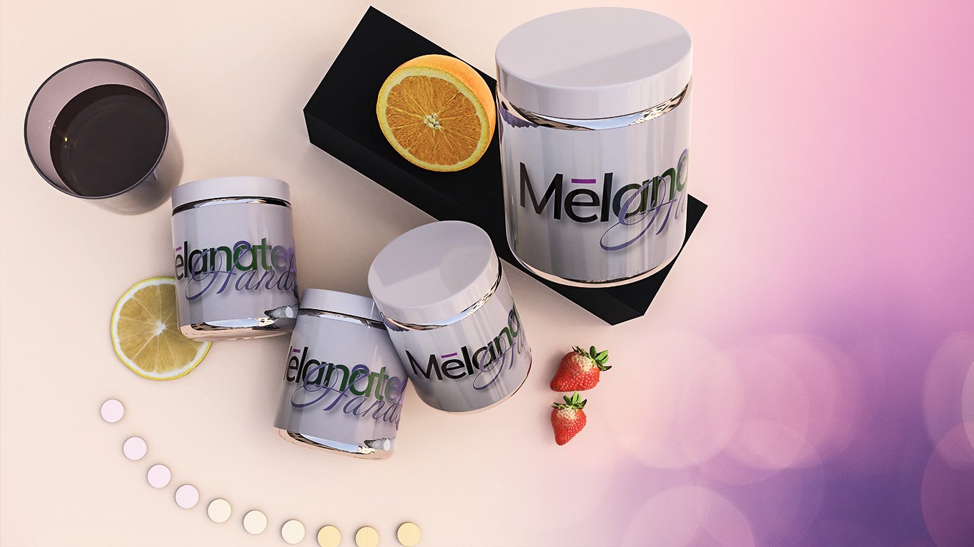
With the identity established, production scaled into three dimensions. Pacdora and Adobe Dimension were brought in to create photorealistic 3D renderings of the product lines across all three divisions — fingernail, skincare, and haircare. This gave the client a full suite of premium product visuals without requiring a physical production shoot, presenting polished, shelf-ready packaging ready for digital storefronts and retail environments alike.
Motion was the final layer. Adobe After Effects and Adobe Premiere Pro were used to build video animations and motion assets — bringing the brand to life in a format built for social media, digital advertising, and content production that could stop a scroll and hold attention.
The result was a complete, ready-to-deploy creative system — every asset, every frame, and every color choice pointing back to the same truth. The product exists for one reason, and that reason is you. Mission: You.
04
Results & Impact
The results are still being quantified through brand awareness metrics and recognition indicators. The Melanated Hands brand is being rolled out in retail environments and online. We hope you enjoy and participate in our Mission, You.
Project Gallery
“
Mikahyla Chiles
CEO - Kphoria Cosmetics